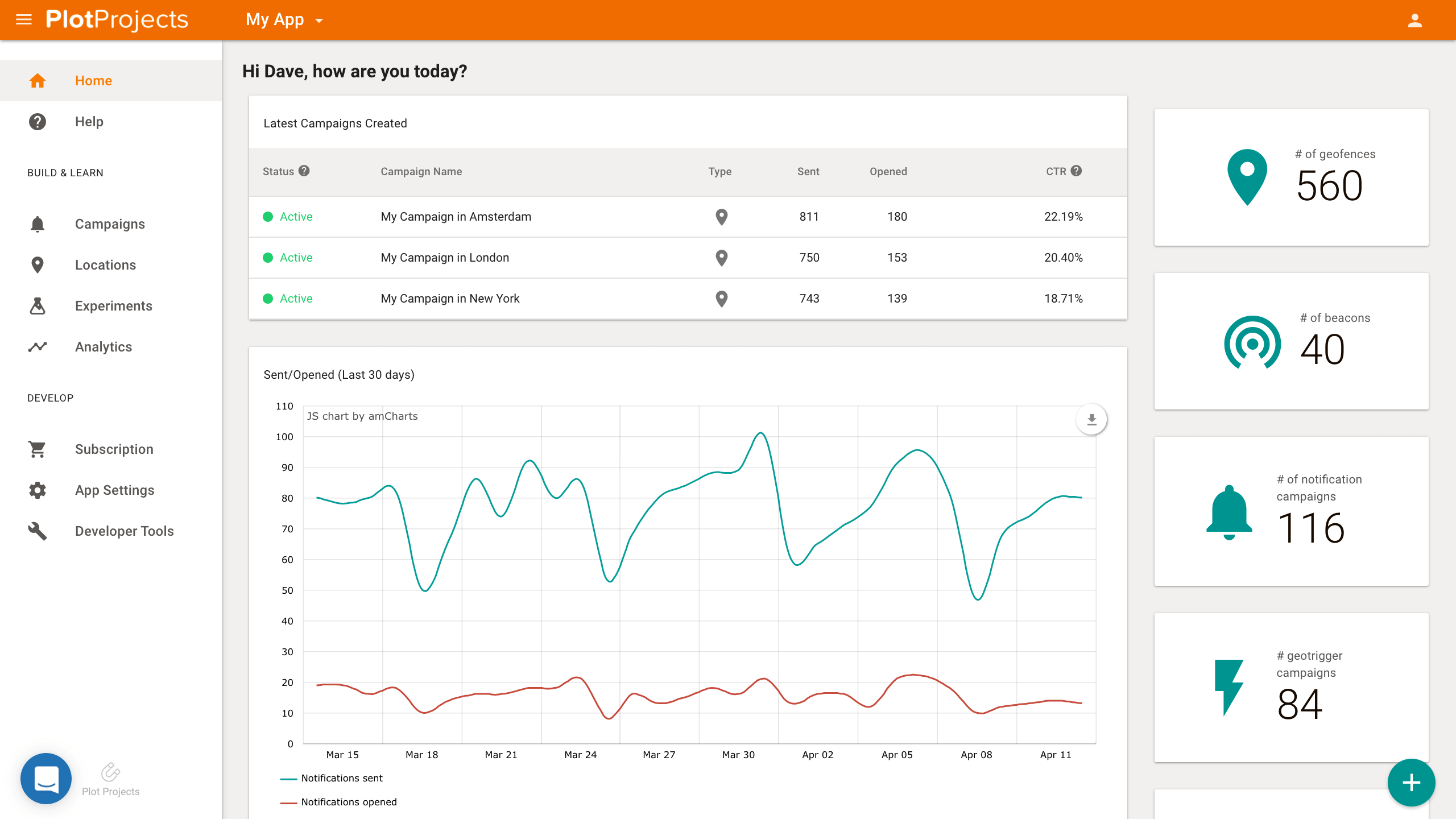
Your dashboard is your control tower, the interface that allows you to create, manage and optimize your campaigns. It is crucial for us to provide you with a dashboard that gets the job done as painlessly and efficiently as possible. Over the last couple of months, we’ve been working on a new dashboard that not only looks better but mostly that delivers the best user experience.
New Home Page Design
What’s new?
New Design and Layout
Notice the cleaner font, the new color scheme and all that breathing room? Our new dashboard design is neater, more modern and more spacious; overall easier to the eye and more user friendly. Those who say looks don’t matter haven’t seen our new dashboard 😉
Here’s what’s new:
- Vertical menu: your menu has been migrated from horizontal and cluttered to a neater vertical format.
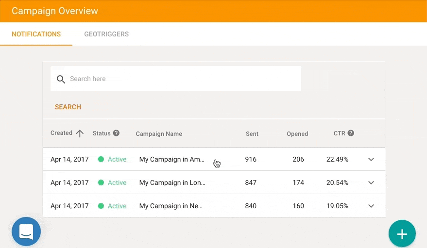
- Updated campaign list: here’s a breezy overview of your latest campaigns, their status, type and performance. We removed all unnecessary clutter for a more straightforward and easy to grasp look and added a dropdown with all the extra insight you might need.
- App-wide notifications performance: want to know how your notifications are performing overall? Your dashboard features an app performance graph (read more about the new graphs below).
- Overview widgets: not only do our pretty new widgets give you a clear idea of the scale of your campaigns, but they give you access your geofences, beacons and campaigns lists.
- Quick access to content: you can find links to our latest blog posts and product updates and stay up to date.
- We greet you, because you deserve that much 🙂
Maps Facelift
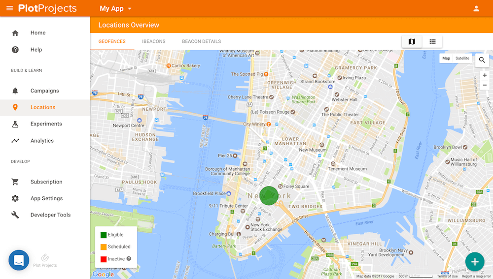
New Geofence Map View
You had access to maps on our old dashboard, but not any like these ones! Let us tell you about those maps. They give you more breathing room, are less crammed, more sizable and more functional (coworker whispers *this map is boyfriend material*). Get a perfect overview of all your locations on spacious maps, see which ones are active, scheduled or inactive and zoom in and out to taste.
Responsiveness
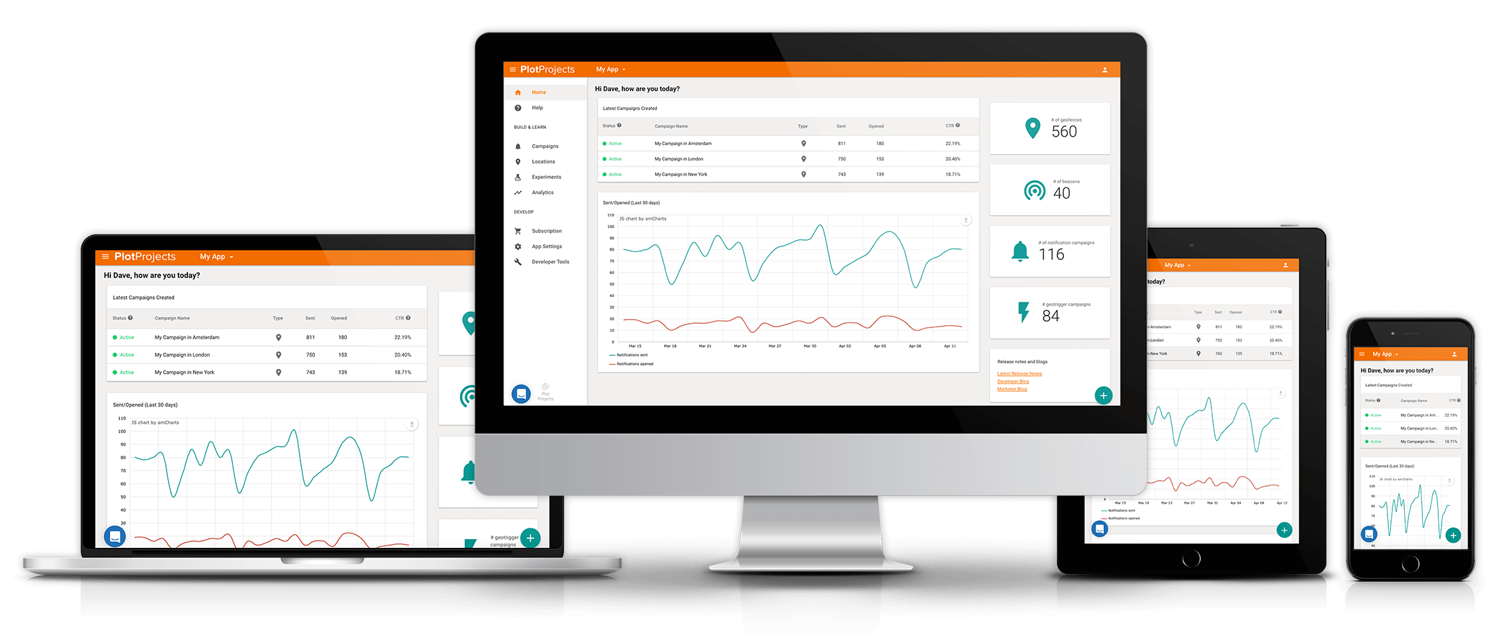
Our dashboard is finally fully responsive and functional on all screens, from computer to mobile and what’s in between. You heard us well, you can now manage and check on your campaigns while on the go (coworker whispers *beacon and chill*).
And last but really not least..
New Graphs
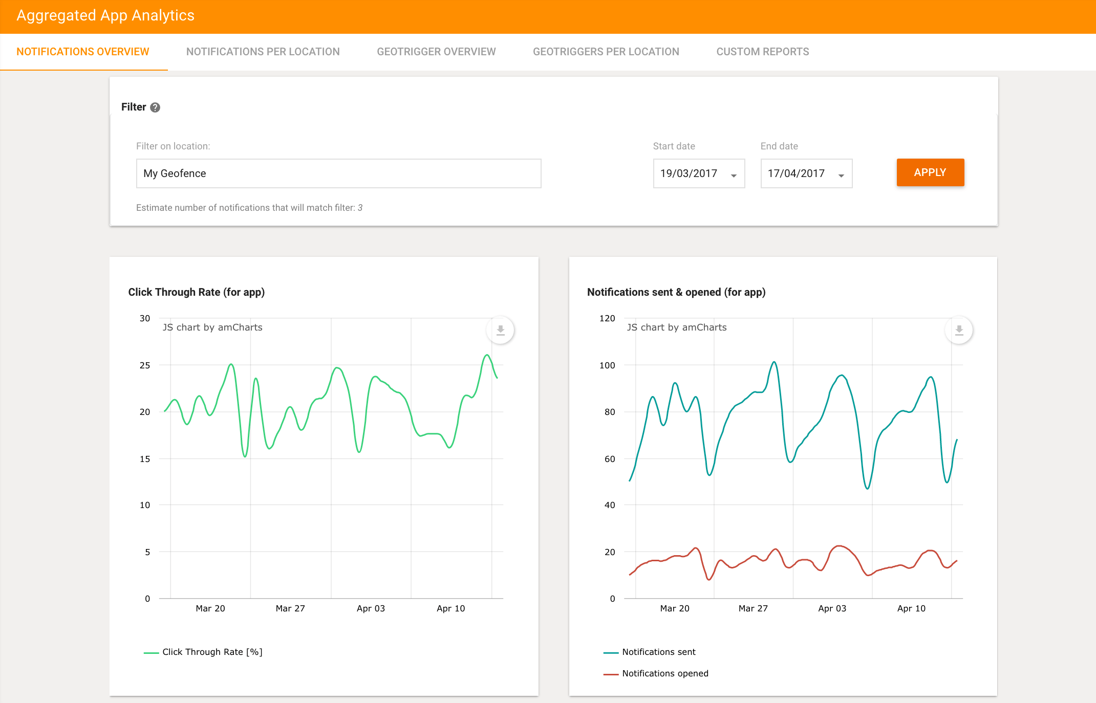
New Dynamic Analytics, provided AmCharts
These graphs, let us tell you, we’re proud of them. First of all, look at how neat they are. But more importantly they are interactive, here’s what you can do with them:
- Annotate (point to a point of the graph, circle something etc.)
- Show detailed stats at any point and time
- Zoom in on a desired time frame
- Print or download in different formats
WHAT’S NEXT?
We really want to provide you with the most comprehensive analytics, so this is what our focus will be on in the next few months. On our to do list: more available insights and custom analytics!
Go have a look at the new dashboard and stay tuned for what comes next.